This function enhances a ggplot object by adding bars with labels indicating
positive values, formatted with a steel blue fill color. It also adjusts the
y-axis scaling and applies a classic theme.
Usage
add_labeled_bars_age_group(g, label = "positive")
Arguments
- g
A ggplot object to which the bars and labels will be added.
- label
the column name of the y variable
Value
A modified ggplot object with labeled bars grouped by age.
Examples
library(ggplot2)
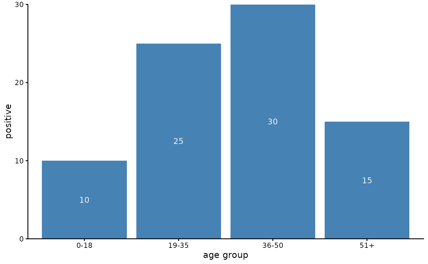
data <- data.frame(
age_group = c("0-18", "19-35", "36-50", "51+"),
positive = c(10, 25, 30, 15)
)
g <- ggplot(data, aes(x = age_group, y = positive))
g <- add_labeled_bars_age_group(g)
print(g)